Throughout my UX Design Bootcamp with Brainstation, we were asked to develop a Capstone Case Study to be designed and iterated on alongside the development of our skills.
As someone diagnosed with ADHD, I naturally gravitated towards the world of accessibility, as I thought of problem spaces I could seek to address.
I grappled with the idea of whether I should explore a problem space that is familiar to me or one that explores concepts I am unfamiliar with. My main fear was that I was going to hit a wall in terms of ideation and not have enough time to effectively pivot my designs while also keeping up with my studies, given the condensed 3-month period.
Through the guidance of my educators, I decided to go with the familiar, as it made the most sense given my unique time constraints.
Problem Statement
Through my initial research, I authored this problem statement.
4% of American adults over the age of 18 battle with ADHD on a daily basis, with diagnoses among adults growing at a rate of 123.3% from 2006 to 2016. For someone with ADHD, their capacity to plan and subsequently execute on those plans consistently can contribute to difficulties in their workplace or studies, strained social relationships, and low self esteem leading to poor mental health.
Initial How Might We Question
In tandem with my problem statement I authored an initial How Might We question.
How might we streamline the act of daily planning, by making it a more engaging and rewarding experience for adults and teens diagnosed with ADHD, so that they can develop positive planning habits that improve their day-to-day lives.
Ideation Through Research
Interview Preparation
I knew it was important to interview individuals living with ADHD to get a clearer picture of their specific needs when it comes to planning.
I decided to narrow my focus to working professionals diagnosed with ADHD, as it occurred to me throughout my research that they would uniquely benefit from the assistance of digital tools. As in most cases they would be without a guardian or partner to help them manage their deficiencies in planning and execution.
I was hoping to identify current pain areas of their day, that could be made easier by the potential intervention of digital tools.
Interview Demographic Focus
Working professionals with ADHD
25 years of age or older
Diagnosed with ADHD at some point in their life
Via Zoom
Synthesizing Core Themes
Synthesizing the qualitative research data gathered by my interviews allowed me to identify shared frustrations, motivations, and behaviours among my chosen demographic.
By using the method of affinity mapping to organize this data, I was able to identify core insights into the experience of adults living with ADHD. Which then led me to solidify my core theme going forward.
Adults with ADHD want to improve their ability to plan and execute, however, there are unique needs and factors that must be kept in mind when designing for this want.
Defining Design Direction
Through the creation of a User Persona inspired by the themes gathered from my qualitative research, I hoped to illuminate what a potential end user of my digital solution might look like.
Which would then help me work backward from my end user, toward a solution that would solve their needs and frustrations.
Ideation Through the User's Eyes
To help churn the ole idea bucket, I created an experience map to get a clear picture of Lucas’ day. Searching for points at which the intervention of a digital solution may help.
This helped me identify the morning routine as a key part of the day I wanted to focus on. My thinking was that if I could somehow create a tool that would become a consistent part of my potential users morning routines, that would provide them with better organization throughout their days.
This idea was given further merit when I noticed that the majority of my interviewees mentioned the mornings as the time of day when they would make lists or attempt to plan.
Possibly indicating a point of the day in which a bit of focus, may go a long way.
Authoring User Stories
Now that I had a solid view of Lucas’ day, I could confidently author user stories from the perspective of more general potential end users.
By organizing the 30 user stories authored into potential functional aspects of my digital solution, I was able to form epics I wanted to explore.
Upon exploration of possible ways to combine these defined epics into real features, they started to fall under the umbrella of Simplifying Task Organization so we can make planning and execution a familiar and far less daunting exercise for our potential end user.
The Flow of Tasks
My selected and outlined task flow provided me the blueprints for the screens and usability needed for my digital tool to function the way I intended.
Roughly, it outlines:
Lucas opening Good Day during his morning routine.
Navigating to his Timeline smoothly by selecting his customized Thursday template, previously set up as what a normal Thursday might look like for Lucas.
Then going through the necessary steps to add a To Do at 11:35 with a customized alarm to remind him he needs to get ready to go to the dentist.
Lucas would then confirm the new To Do, which would return him to his Timeline screen.
He would then set his Timeline to “Run” mode and get started on his Good Day.
Task Flow
Sketching into Reality
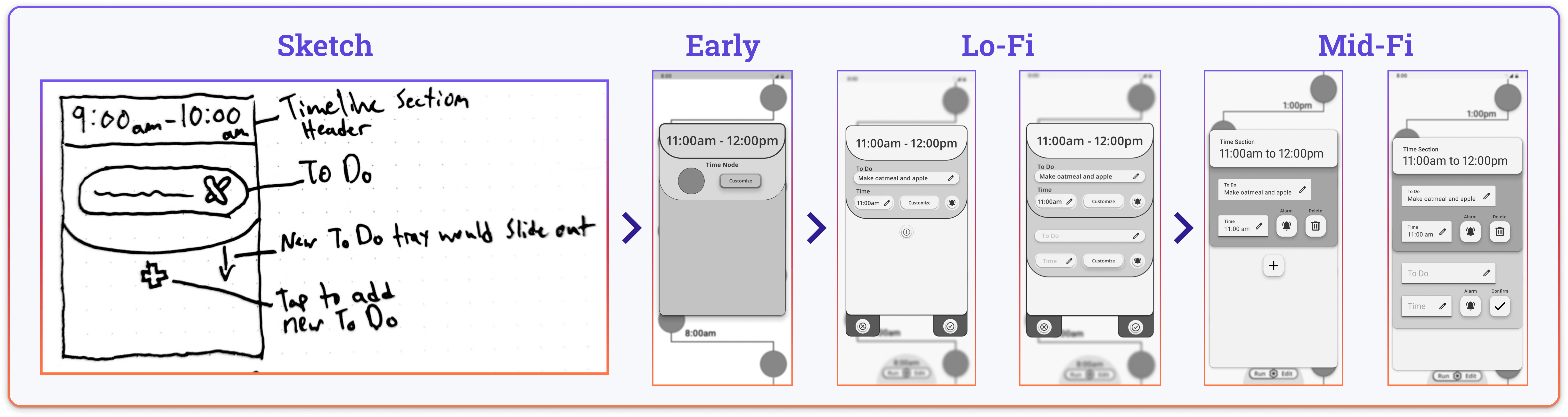
Having my main task flow outlined allowed me to start searching for visual and functional design inspiration. Using those inspirations as a jumping-off point I began sketching early versions of the screens I would need to design.
The evolution from early sketches, to Lo-Fi wireframes, then onto Mid-Fi was shaped and validated through two rounds of usability testing with each round consisting of five participants.
The testing sessions involved each user running through an outlined scenario written from my user persona’s point of view. Giving the participants needed context as they worked to add a new To Do to their timeline screen for 11:35 am to remind themselves they need to get ready to go to the dentist.
Between rounds I would reflect on the data gathered by compiling my testing notes into a document detailing each users results and specific experience when completing each of the 5 tasks I outlined for them.
Each potential revision identified through the testing document was then put onto a design prioritization matrix that would help me determine which updates were the most time efficient to address while having the largest positive impact on the usability of my prototype.
Day Start Screen
The biggest changes to the Home Screen came during the jump to Hi-Fi. Throughout the testing and iteration process, it served its purpose to be an uncomplicated starting point for the user as they begin planning their day.
Day Builder Decision Screen
While working towards evolving my Lo-Fi wireframes into Mid-Fi wireframes, I learned the importance of including Material Design assets if you are designing for Android, to make the handoff to developers as easy as possible.
User testing indicated a need to improve the visual hierarchy of the cards and modals. I achieved this by replacing most of my prototype elements with redesigned assets from Material Design 3 by the time I had reached my Mid-Fi wireframes, this was a huge undertaking but seemed necessary going forward into Hi-Fi.
Template Selection Screen
Multiple users communicated slight confusion with the header copy of the screens and modals. This led me to refine the header copy throughout, to improve user’s ability to recognize the purpose of a screen right away. For example “Saved Templates” became “Saved Templates For Your Day”.
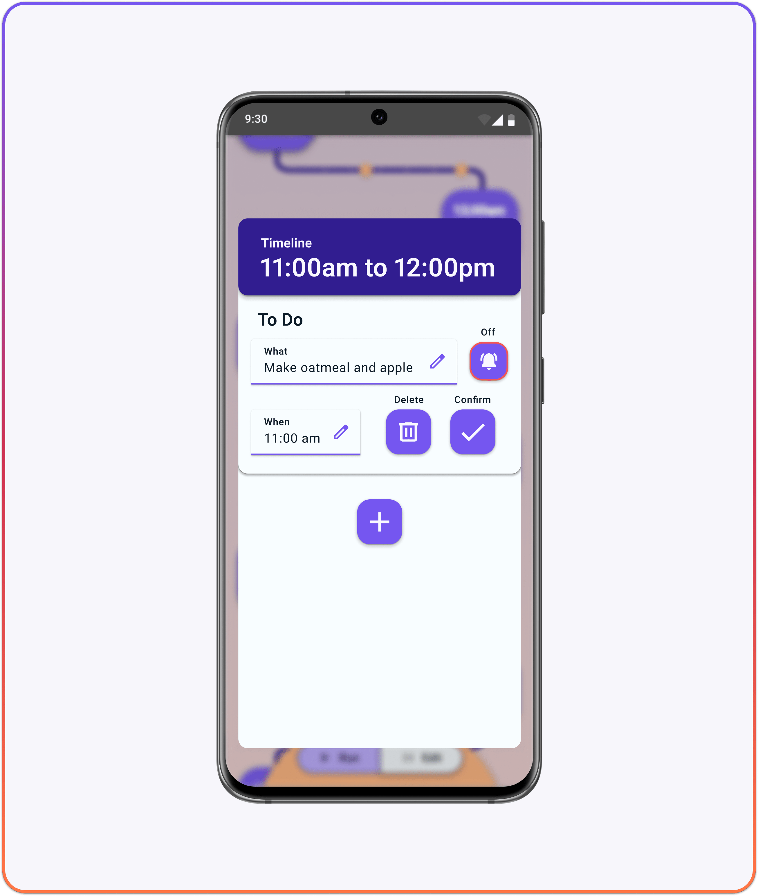
Timeline Section Modal
The highest impact changes were made to the design and layout of the Timeline Section Modal, with the goal of improving the usability of all elements of this section of my task flow.
The “+” button to add a To Do was made larger and more visible in relation to the other UI elements by turning it into a FAB (floating action button).
The “customize” button was removed and the whole layout of the To Do card was redesigned with Material Design 3 assets.
Timeline Section Modal - Alarm Settings
While redesigning the To Do card, a “Reminder Before” option was added to the alarm settings. I was alerted by an individual tester who had ADHD that the time context of my scenarios alarm lacked logic.
If the To Do’s purpose was to remind the user that he needed to go to the dentist there should be a reminder beforehand to get ready, not a reminder that he now needs to drop everything and go to the dentist.
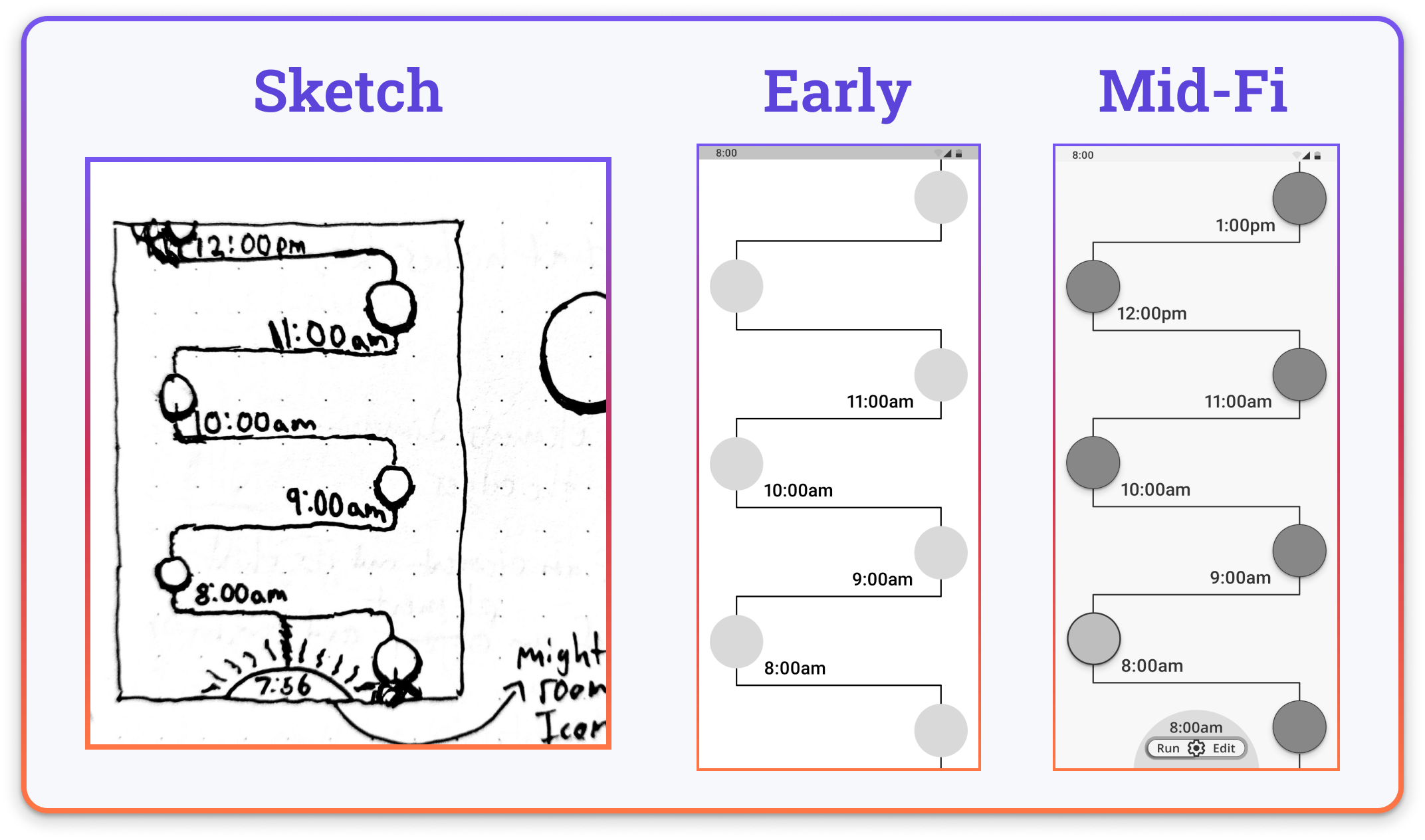
Timeline Screen
The Timeline Screen was similar to the Home Screen in that they both received most of their changes during the jump to Hi-Fi. However, there were still elements added.
A persistent time clock was added at the bottom of the screen that would display the current time and allow the user to toggle their timeline into edit mode or run mode, which would pause the progression of the timeline visually in edit mode. My goal was to give the user a visual distinction between the timeline progressing and it is stopped, similar to the way you would interact with a wristwatch by stopping the movement of the clock hands before adjusting them to the new desired time.
The Timeline Section buttons were also made darker and given drop shadows to better indicate their interactability.
With a refined greyscale Mid-Fi prototype complete, it was now time to make the jump to Hi-Fi. However, before that big step could be made I would need to properly develop a brand identity for my digital solution.
Brand Building
When developing the brand for Good Day I knew I needed to keep the ADHD community at the front and centre of my mind creatively.
This creative exercise began by curating a list of descriptive words or phrases, as well as a “More A than B” list. Both were meant to illustrate how I wanted Good Day to be perceived by its users.
With these light creative guidelines set, I then worked on compiling a collection of imagery that inspired the direction I had outlined.
Moodboard Highlights
These are some highlights of my search for inspiration. I began to focus on certain themes as I documented why I chose specific images. I gravitated towards solitary imagery, that evoked a sense of comfort despite being alone in an environment. ADHD days can feel solitary and uncertain. Finding comfort in that uncertainty felt important to me throughout the definition of Good Days branding.
The theme of the perfect quiet morning also became important to me. I wanted the mornings to be a check-in point for users before they start out on a new day. So my goal was communicating visually what makes mornings such a unique and special time.
Brand Name Exploration
I had liked “Good Day” as a potential brand name during the development of my Mid-Fi wireframes. My goal at this point was to explore if there were any variations or alternatives that made more sense.
Gooday
This was an alternative of Good Day that came about during sketching, through the idea of avoiding having two back to back letter Ds. In the end, it felt like the negatives outweighed the positives, and I liked the simplicity of Good Day.
Timeline
I briefly thought about naming it after a core feature of the app, to build user familiarity right away. However, it lacked any special meaning or inspiration.
D'oer
The thought behind this option was that there would be a ton of odd ways to take the wordmark design. Thematically it was tied to the idea of an ADHDoer, hopefully inspiring users to get things done. In the end, the lack of inherent context provided caused me to move on.
Time Care
I liked that Time Care immediately conveys that the goal of my digital solution is to help. Struggling with planning and execution is a serious problem for those living with ADHD, so to let users know my app was aware of this was important to me. On the other side of the coin though, it feels way too clinical while conveying the right themes. I felt Good Day conveyed the same themes while connecting a bit deeper.
Good Day
My initial idea stood the test of exploration. It simply conveys the message I wanted to deliver. It communicates to potential users that whoever designed the app is aware of how hard it can be to just have a Good Day when living with ADHD.
The goal with ADHD is to always to have a good day, but sometimes this can feel like an impossible task. I wanted potential users to connect with the WHY behind the design of Good Day. A simple tool to help someone have a good day.
Wordmark & Icon Design
My initial idea stood the test of exploration. It simply conveys the message I wanted to deliver. It communicates to potential users that whoever designed the app is aware of how hard it can be to just have a Good Day when living with ADHD.
The goal with ADHD is to always have a good day, but sometimes this can feel like an impossible task. I wanted potential users to connect with the WHY behind the design of Good Day. A simple tool to help someone have a good day.
Hi Fi Prototype
The jump to Hi-Fi for Good Day was not without its challenges. Diving head first into this 3-month trial-by-fire boot camp and coming out only missing one eyebrow and several teeth was an accomplishment I could be proud of.
I knew before injecting colour into my greyscale prototype I wanted to fine-tune the look and usability of my screens. So as I experimented to find the right balance of colour, so I could be confident elements wouldn’t need to be changed drastically later in the process.
Many hours and an unhealthy amount of coffee later I had reached a point I was proud of. I had produced a working Hi-Fi Prototype of my digital solution…
Day Start Screen
My goal with the start screen was to have an engaging and visually simple first step toward a Good Day. I decided to design my own START button as opposed to using a material design asset, as I did with most other interactable elements. I think if I were to redesign certain aspects of Good Day in the future I would scrap this in favour of a large FAB, and add engaging visuals elsewhere on the screen.
Day Builder & Template Selection
I redesigned the cards on the day builder and template selection screens to be more visually cohesive with each other, as well as the timeline section modal. I refined the header copy to make it more informative of the function of each screen, while also delivering on the copy tone I had established for Good Day. I wanted to communicate with the user in a kind, but direct way.
Timeline Screen
The final version of the timeline screen saw me update most elements with material design assets. The timeline track was created by taking a material design slider component and modifying the spacing of the dots along the track to indicate 00, 10, 20, 30, 40, 50, and 60 increments. I added a visual indicator on the time track of where the user is in their day.
In the future, I would include a prototyped onboarding dialogue that would explain what each aspect of the timeline is for. My usability testing indicated the Timeline Screens function was fairly intuitive, however, I felt it would be important to make the less obvious elements immediately recognizable for the user.
Timeline Section Modal
With the redesign of the Timeline Section Modal I focused on consistency in terms of spacing and the different states of components. As the layout changed I continuously referred back to the notes from my usability testing to validate each change. In the end, I feel great about this aspect of my prototype being the focal point for most of the user’s interaction.
The work Never Stops
Marketing Website
I chose to design a marketing website for Good Day, in order to communicate the app’s goals clearly to potential users. I wanted to start to build awareness of Good Day as a tool designed with the ADHD community in mind as well.
Tarot Cards of Tech
In an exercise to identify potential impacts Good Day might have that aren’t obvious right away, I explored the Tarot Cards of Tech
I believe that if my design was too tailored to the ADHD brain, it might close the door for potential universal design appeal. Something I enjoy about Good Day, is it might have applications outside of the realm of ADHD, for people who simply want a more streamlined digital planning tool.
A possible sub-user group that might fit that mold is the elderly. During user testing, I noticed that the eldest participants don’t want tons of features on their apps as they can get overwhelmed and confused when using tech. So this might be the perfect tool for them as well.
It would be a possibility to add features specifically designed with the elderly in mind, maybe a volume control on the alarm settings, or a more robust template feature seeing as the elderly generally have set routines for their days.
A thought in the back of my head throughout the design process was “I think people who aren’t aware of ADHD accessibility might perceive Good Day as simple and lacking in features”. The counter to that is the fact that there are neurotypical people who just prefer simplicity in their apps, and Good Day would appeal to them.
A collaborative version of Good Day came to mind during this exercise, it could be a tool for a significant other to add To Do’s to their partners timeline, or a shared tool used by a small work team.
I decided early on in the design process to focus more on the adult side of ADHD accessibility. Hoping that children would have guardians that can help them develop habits and methods that would ease their symptoms going into adulthood
Another area I didn’t get a chance to focus on was how Good Day could adapt to benefit the different subgroups of ADHD. Hyperactive/impulsive, inattentive/distractible, and combined type. In the future it might be possible to input that information and it would alter certain features of Good Day.
I would hope that Good Day would be embraced by the ADHD community. If it helped one person they would be more likely to pass it on to the next. Hopefully getting Good Day in the hands of people who it could help.
One aspect I failed to consider was that not everyone wants to be so open with their diagnosis. So it might prevent people from using it in fear of being outed or part of the community when they don’t want to be.
Multiplatform Use
When examining other platforms Good Day might exist on, it dawned on me that a companion app for a smartwatch would be almost too perfect for Good Day. The ideas for possible integration between smartwatches and mobile came flooding in.
Users could set their timeline on their phone and then follow along with it visually on their smartwatch throughout the day.
You could add/remove To Dos right from your smartwatch, filling in the information needed through speech-to-text.
A quick timer widget could be provided that would enable users to practice the Pomodoro technique for productivity. Something that has been proven to help those with ADHD when it comes to getting things done.
The puzzle to dismiss alarms could live on the watch face, when you have the right answer you shake your wrist or make a throwing motion. This would make engaging with alarms an actually fun exercise, increasing the likeliness of consistent use.
This is an example of what a smartwatch companion app for Good Day might look like.
When designing for Smartwatches, it’s recommended to size everything for the smallest viewport. So that it can easily be scaled up to the varied screen sizes and shapes available.
Reflections
Nearing the end of this case study, I think it’s important to reflect and determine if I solved for the goals I set out to solve.
I believe that my Hi-Fi prototype effectively demonstrates how Good Day solves for my initial how might we question by making the exercise of daily planning a more streamlined and engaging experience. I think it’s a fantastic sign that ideas come naturally and in abundance when thinking of where the design could go next.
With some breathing room available I was able to take a good look at all I had accomplished and it left me a bit shocked at how far I’ve come in the past 3 months.
Learned Truths
Among many things,
I learned the importance of validating your design direction through genuine realizations, that have been built upon thoughtfully gathered data. So you can avoid ending up at a hollow endpoint after putting so much energy into the design process.
Having conversations with peers and explaining the core idea of Good Day has been an extremely validating exercise. I’ve left each conversation feeling more confident than before that Good Day should be a digital tool that already exists.
This leads me to one of the most important things I’ve learned during my UX Design journey so far. If you’re wondering why something doesn’t exist already, that’s a pretty damn good indication that you’re on the right track toward creating something meaningful.